We will be following on from the analysis we conducted in Workshop 5 (Distributions and Basic Statistics). We visually explored differences in the income levels between different groups of people in the US census. Now, we are going to conduct hypothesis testing to see if those differences are statistically significant.
mkdir: data: File exists
mkdir: data/wk7: File exists
  % Total    % Received % Xferd  Average Speed   Time    Time     Time  Current
                                 Dload  Upload   Total   Spent    Left  Speed
100 22.4M  100 22.4M    0     0  16.5M      0  0:00:01  0:00:01 --:--:-- 16.6M
#This tells python to draw the graphs "inline" - in the notebook%matplotlib inline import matplotlib.pyplot as pltfrom scipy.stats import normimport statisticsimport seaborn as snsimport pylabimport pandas as pdimport numpy as np# make the plots (graphs) a little wider by defaultpylab.rcParams['figure.figsize'] = (10., 8.)sns.set(font_scale=1.5)sns.set_style("white")
df=pd.read_csv('./data/wk7/cps.csv')df['race']=df['race'].astype('category')df['income']=df['incwage']/1000df=df[df['income']<200]df=df[df['year']==2013] # filter the dataframe to only contain 2013 datadf.head()
year
state
age
sex
race
sch
ind
union
incwage
realhrwage
occupation
income
20
2013
50
62
1
1
14.0
8090
1.0
57000.0
23.889143
.
57.0
32
2013
39
59
1
1
13.0
9590
0.0
62000.0
29.726475
Consruction, Extraction, Installation
62.0
34
2013
44
44
1
3
12.0
7290
0.0
45000.0
20.745834
.
45.0
36
2013
12
41
1
1
12.0
7070
1.0
28000.0
12.293828
Managers
28.0
37
2013
33
35
1
1
12.0
770
0.0
42500.0
20.377020
Transportation and materials moving
42.5
This is once again the U.S. census data from Week 5. As a reminder, our dataframe has 10 columns:
So far in this workshop, we’ve had the luxury of being able to draw many random samples and plot the distributions of their sample means to infer the population mean. The Central Limit Theorem lets us assume that these sample means are normally distributed, and consequently that there is a 95.45% chance that the population mean within two standard errors of the sample mean. This allows us to make inferences on the basis of a single sample. The standard error is the
Sample Standard Deviation
\[\huge s = \sqrt{\frac{1}{n-1} \sum_{i=1}^n (x_i - \overline{x})^2}\]
Standard Error
\[\huge se = \frac{s}{\sqrt{n}}\]
Given a large enough sample \(x\), we can build a 95% confidence interval as follows:
\[ \huge 95\% CI = \overline{x} \pm (1.96 \times se)\]
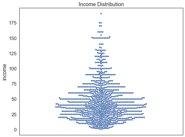
Let’s draw a sample of 1000 random individuals from our data, and compute a 95% confidence interval to estimate the population mean for income. We’ll begin by creating a swarmplot to get a sense of how the data are distributed.
sample=df.sample(1000) # draw a random sample of 1000 observations from the dataframesns.swarmplot(data = sample, y='income') # plot a swarmplot of incomeplt.title('Income Distribution') # add a title
Text(0.5, 1.0, 'Income Distribution')
Now let’s set about calculating the 95% confidence interval and plotting it on our swarmplot. Luckily, the components we need to this are easy to calculate. We just need the mean, standard deviation, and number of observations. All of these are provided by the .describe() function, which calculates summary statistics for a sample.
desc=sample['income'].describe() # calculate descriptive statistics for the sampleprint(desc) # print the descriptive statistics
count    1000.000000
mean       47.677568
std        33.041244
min         0.700000
25%        25.000000
50%        40.000000
75%        62.000000
max       190.000000
Name: income, dtype: float64
From the set of descriptive statistics, we can pull out the relevant components, calculate the standard error, and create a 95% confidence interval as follows:
mean=desc['mean'] # set the mean equal to a variable called "mean"std=desc['std'] # set the standard deviation equal to a variable called "std"n=desc['count'] # set the sample size equal to a variable called "n"se=std/np.sqrt(n) # calculate the standard error of the meanprint('The mean is', round(mean, 2), 'with a standard error of', round(se, 2)) # print the mean and standard errorupper_ci = mean+se*1.96# calculate the upper confidence intervallower_ci = mean-se*1.96# calculate the lower confidence intervalprint('The 95% confidence interval is', round(lower_ci, 2), 'to', round(upper_ci, 2)) # print the confidence interval
The mean is 47.68 with a standard error of 1.04
The 95% confidence interval is 45.63 to 49.73
Finally, let’s plot these bounds on our swarmplot to graphically show this range. We can now claim that based on our sample, there is a 95% chance that the true population mean of income (shown in red) lies within this range.
sns.swarmplot(data = sample, y='income',alpha=0.5) # plot a swarmplot of incomeplt.axhline(df['income'].mean(), color='red', linestyle='solid', linewidth=3, label='Population Mean') # add a horizontal line at the meanplt.axhline(upper_ci, color='black', linestyle='dashed', linewidth=3) # add a dashed black line at the upper confidence intervalplt.axhline(lower_ci, color='black', linestyle='dashed', linewidth=3) # add a dashed black line at the lower confidence intervalplt.title('Income Distribution, 95% Confidence Interval') # add a title
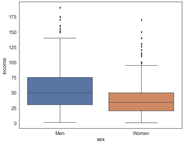
If we create a boxplot of income disaggregated by sex using our sample, we can observe that men seem to earn more than women:
sns.boxplot(data=sample , x='sex', y='income').set_xticklabels(['Men','Women']) # make a box plot of income by sex
[Text(0, 0, 'Men'), Text(1, 0, 'Women')]
But is this difference statistically significant? It could just be due to sampling error, random chance. Hypothesis testing provides a framework through which we can formally evaluate the likelihood of encountering an effect as extreme (in this case, the the difference between the mean incomes between both groups) as the one we observe in our data. There are four main steps in hypothesis testing:
State the hypotheses. H0 states that there is no difference between the two population means.
Select an \(\alpha\) level (e.g. 95% confidence), and select a corresponding critical value (1.96 for large samples)
Compute the test statistic.
Make a decision; if the test statistic exceeds the critical value, we reject the null hypothesis.
Steps 1, 2, and 4 remain fairly constant regardless of what kind of hypothesis testing you’re conducting. Step 3 can vary quite a bit, as there are many different statistical tests that fall under the umbrella of hypothesis testing. In today’s workshop we’ll be using the Student’s T-Test (more on that in a second). For now, let’s begin the process of hypothesis testing a
1. State the hypotheses
The Null Hypothesis
\(H_0\) : There is no difference in the mean income between men and women
Locate the critical region; the critical values for the t statistic are obtained using degrees of freedom (\(df=n-2\)). Given that we have 1000 observations, \(df=998\). If \(df>1000\), you can simply memorize the following critical values:
At the 95% confidence level, the critical value is 1.96
At the 99% confidence level, the critical value is 2.58
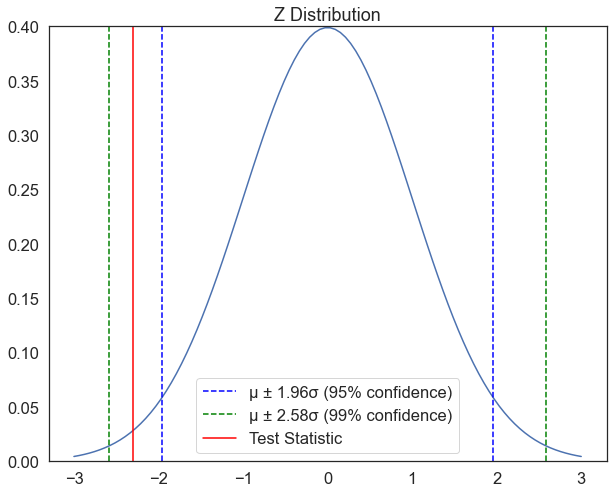
If our test statistic exceeds either of these values, we can reject the null hypothesis with the according level of confidence. The function below creates a plot which provides a visual reference for these values, but isn’t really necessary for the process of hypothesis testing. The function accepts one argument test_statistic, which it will use to plot a vertical red line. If the red line falls within the dotted lines, we fail to reject the null hypothesis at the corresponding confidence level. If it’s outside of these bounds, we reject the null hypothesis.
In the last line of code below, i’ve called the function to plot a test statistic of -2.3; Would we reject the null hypothesis at the 95% confidence level? what about the 99% level?
def plot_z(test_statistic): mu, se=0, 1# create two variables, a mean "mu" equal to zero, and standard deviation "se" equal to 1 x = np.linspace(mu -3*se, mu +3*se, 100) # create a range of values from -3 to 3 standard deviations plt.plot(x, norm.pdf(x, mu, se)) # plot the normal distribution plt.axvline(mu-se*1.96, color='blue', linestyle='dashed', linewidth=1.5,label='µ ± 1.96σ (95% confidence)') # plot a vertical line at the mean plus 2 standard deviations plt.axvline(mu+se*1.96, color='blue', linestyle='dashed', linewidth=1.5) # plot a vertical line at the mean minus 2 standard deviations plt.axvline(mu-se*2.58, color='green', linestyle='dashed', linewidth=1.5,label='µ ± 2.58σ (99% confidence)') # plot a vertical line at the mean plus 2 standard deviations plt.axvline(mu+se*2.58, color='green', linestyle='dashed', linewidth=1.5) # plot a vertical line at the mean minus 2 standard deviations plt.axvline(test_statistic, color='red', linestyle='solid', linewidth=1.5,label='Test Statistic') # plot a vertical line at the test statistic plt.ylim(0,0.4) plt.legend() plt.title('Z Distribution') # add a title plt.show()plot_z(-2.3)
3. Calculate the Test Statistic (The Student’s T-Test)
The Student’s T-Test is an independent-measures design which is used in situations where a researcher has no prior knowledge about either of the two populations (or treatments) being compared. In particular, the population means and standard deviations are all unknown. Because the population variances are not known, these values must be estimated from the sample data.
The purpose of a T-test is to determine whether the sample mean difference indicates a real mean difference between the two populations or whether the obtained difference is simply the result of sampling error. Given two groups, \(x_1\) and \(x_2\), the \(t\) statistic is calculated as:
\[ \Huge t = {\frac{\overline{x_1}-\overline{x_2}} {\sqrt{\frac{s^2_1}{n_1} + \frac{s^2_2}{n_2}}}} \]
Where:
\(\overline{x}\): Sample Mean
\(s^2\): Sample Standard Deviation
\(n\): Number of observations
We’ve already seen how to calculate each of these components when we made the 95% confidence interval above using the .describe() function. To calculate the t-statistic, we just have to plug these values into the formula above and do some basic arithmetic. I’ve put together a function that does this below, which accepts two main arguments, group1 and group2. For each group it calculates descriptive statistics, and uses these values to calculate the t-statistic. It also has an optional argument plot, which when set to True will plot a 95% confidence interval for each group. It defaults to False, meaning that it won’t generate the plot.
def manual_ttest(group1, group2, plot=False): # define a function called "manual_ttest" that takes two groups and a boolean value for whether or not to plot the results as arguments desc1, desc2=group1.describe(), group2.describe() # get descriptive statistics for both samples n1,std1,mean1 = desc1['count'], desc1['std'] ,desc1['mean'] # get the sample size, standard deviation, and mean of the first sample n2,std2,mean2 = desc2['count'], desc2['std'] ,desc2['mean'] # get the sample size, standard deviation, and mean of the second sample# calculate standard errors se1, se2 = std1**2/n1, std2**2/n2 # '**2' is the same as squaring the number# standard error on the difference between the samples sed = np.sqrt(se1 + se2)# calculate the t statistic t_stat = (mean1 - mean2) / sed# print the resultsprint("Group 1: n=%.0f, mean=%.3f, std=%.3f"% (n1,mean1,std1)) print("Group 2: n=%.0f, mean=%.3f, std=%.3f"% (n2,mean2,std2))print('The t-statistic is %.3f'% t_stat) # print the t-statisticif plot==True: # if the plot argument is set to True, plot the results groups=pd.DataFrame() # create an empty dataframe i=1# create a counter variable called "i" and set it equal to 1for group in [group1, group2]: # loop through each group in the list of groups plot_df=pd.DataFrame({'Values': group,'Group':i}) # create a dataframe with the values of the group and a column called "Group" that contains the group number groups=groups.append(plot_df) # append the dataframe to the list of dataframes i+=1# increase the counter by 1 sns.pointplot(data=groups , x='Group', y='Values',errorbar=('ci', 95), color='black', join=False, capsize=.8) # plot the means of the groups with a 95% confidence interval plt.title('Comparison of Group Means with 95% Confidence Intervals') # add a titlereturn t_stat # return the t-statistic
Having defined the function, we can now call it to calculate a t-test for the difference in income between men and women
men=sample[sample['sex']==1] # filter the sample to only include menwomen=sample[sample['sex']==2] # filter the sample to only include woment = manual_ttest(men['income'],women['income']) # run the t-test function and store the t-statistic in a variable called "t"
Group 1: n=485, mean=57.435, std=36.610
Group 2: n=515, mean=38.489, std=26.179
The t-statistic is 9.364
4. Make a Decision
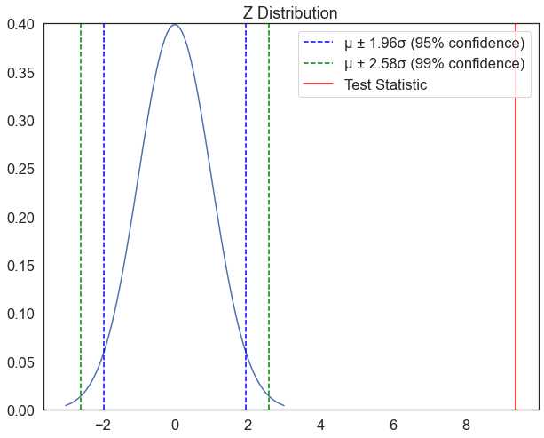
If the t statistic indicates that the obtained difference between sample means (numerator) is substantially greater than the difference expected by chance (denominator), we reject H0 and conclude that there is a real mean difference between the two populations or treatments. Let plot the T-statistic from our test against the critical values:
plot_z(t) # plot the test statistic on the z distribution
Based on the plot above, can we reject the null hypothesis that there is no difference in mean income between men and women?
Exercise
From the main dataframe df, draw a sample of 500 white men. Using t-tests, investigate whether there are statistically significant discrepancies in pay between white men and other groups (note: it would be best to sample 500 people in each of those groups as well). Between what groups does there exist the most significant pay gap?
Some of this variation may be due to occupation. Compare income disparities between men and women within different occupations. Which occupation has the largest pay gap? which has the smallest?
Research suggests that within occupational groups, collective bargaining through union membership reduces pay gaps. Read the abstract of this article, and try to replicate the analysis using our dataset.
Assessed question
Which occupation has the lowest income disparity between men and women? Use a For Loop and the manual_ttest() function, and ignore the “.” category.